3-Steps to a Successfully Designed Spa Ad
Ads are a quick and effective way to showcase your event or business. However, if done improperly they can be a quick way to lose a potential client’s interest or even worse, not even get their attention at all.
Here are 3 steps to ensure the design of your spa ad, whether online or printed, will entice your viewers.
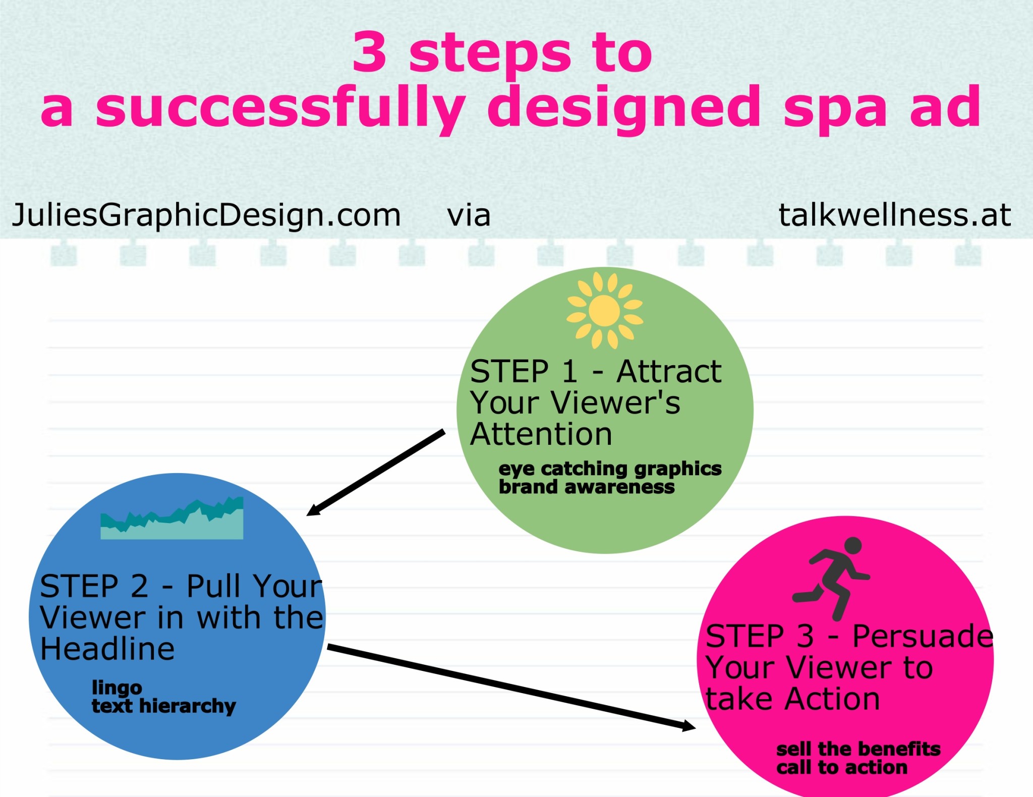
STEP 1 – Attract Your Viewer’s Attention
Eye-catching graphics.
For spa ad, place supporting graphics that accurately support the content. Remember one large image can have a bigger impact than four smaller ones. Pick your graphics wisely, this is your chance to be clever with the imagery. Dare to stand out from the crowd. A model photographed at a unique angle or wearing a bright accessory would catch your attention. If you have before and after shots, limit to only using a couple “wow” sets. Too many before and afters can lower their impact and quickly clutter up your spa ad.
Brand awareness.
One of the most important elements of an effective advertisement is creating brand awareness. The goal is to embed your spa’s name, logo and feel into your viewer’s subconscious so they remember you and all that you offer. Your spa ad should use your brand’s font sets, colors, and textures. Your logo should be clearly visible and only secondarily prominent to the main headline.
STEP 2 – Pull Your Viewer in with the Headline
The lingo.
The success of your ad can be greatly impacted by its headline. A powerful headline can be: benefit driven, news oriented, curiosity driven, or how-to oriented.
Benefit Driven Example: “You Too Can Have Clear Skin Overnight”
News Oriented Example: “Amazing New Formula Cures Sun Spots”
Curiosity Driven: “Are You Making These Deadly Moisturizing Mistakes?”
How-to Oriented: “How to Reduce Bags Under the Eyes”
Text hierarchy.
Make the hierarchy of the content clear. The headline should be the main focus and clearly stand out. When you look at the design your eye should go to the headline first. Your visual hierarchy should match the content hierarchy. This can easily be done by choosing larger, brighter or thicker type for the headline and smaller, more subtle colored type for the body text. Use plenty of subheadings and white space so readers can easily scan the body content.
STEP 3 – Persuade Your Viewer to take Action
Sell the benefits.
Try to leave out all of the “me” copy and sell the benefits. Instead of just listing the features of your spa product or spa services try explaining what the features will do for your prospect personally.
Call to Action
Phrases such as, “call now”, “come in today”, “sign up right now” trigger an emotional response from your viewer. Make your call-to-action clear, so your prospect knows exactly what to do. This should be placed where it is one of the last things the viewer reads. An italicized call to action can signify movement and help give the call-to-action a little more of a push.
Finally
Ask yourself… Does the spa ad visually represent my spa? Does it stand out from a crowd and grab a potential client’s attention? Is the message clearly stated? Am I overwhelmed when I look at the spa ad? Do I know where to look first, second and last? Is the call to action clear and enticing?
If you would like help with your spa ad design, visit me, Julie at JuliesGraphicDesign.com.
About Julie, Graphic Designer and Blog Writer:
After graduating from Northern Michigan University – known for its outstanding art programs – Julie began her career as a graphic designer full time at a marketing/printing company. She has worked at this company for ten years. During this time the design department grew tremendously as well as her knowledge of the print world. It has been a great stepping stone working for a company that made it possible for her to design for some of the most prestigious businesses in the area.
Julie has a young daughter and together they enjoy camping, hiking, and painting in their home place Michigan.
all photo rights by Julie


